Designing mobile experiences for people who were never meant to learn smartphones.
Our mission is to build a digital experience for the elderly that serves them not only functionally but also emotionally with clarity, ease, and respect. Our UX philosophy is rooted in empathy and simplicity. Every interaction should feel intuitive, safe and empowering—even for a first-time smartphone user.
Our Mission
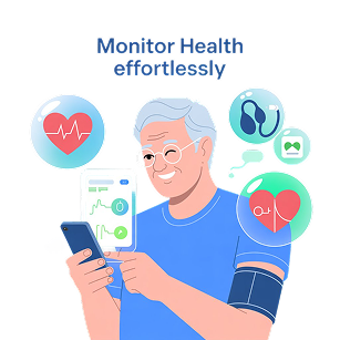
Build a digital experience for the elderly that serves them not only functionally but also emotionally with clarity, ease, and respect. Our UX philosophy is rooted in empathy and simplicity. Every interaction should feel intuitive, safe and empowering—even for a first-time smartphone user.
Six Core Principles
The following principles guide every design decision:
Predictable Navigation
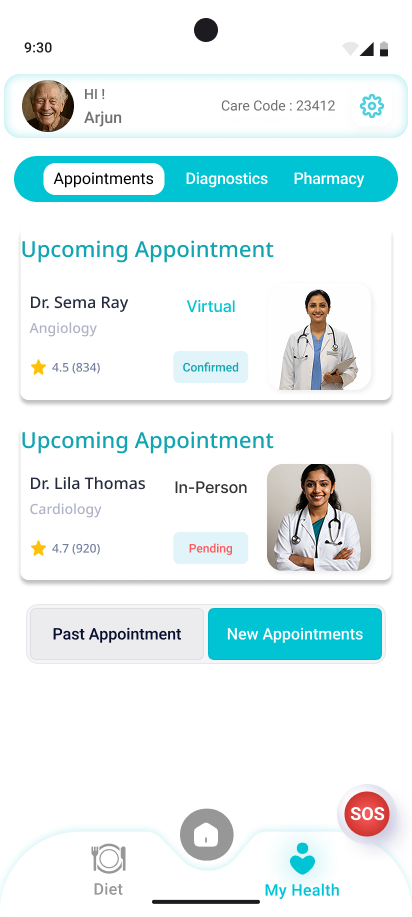
We prioritize clarity and consistency in navigation. Every screen should lead somewhere meaningful, with obvious next steps and no dead ends. Users should never feel lost or unsure of how to proceed.
Design that Respects Hands and Eyes
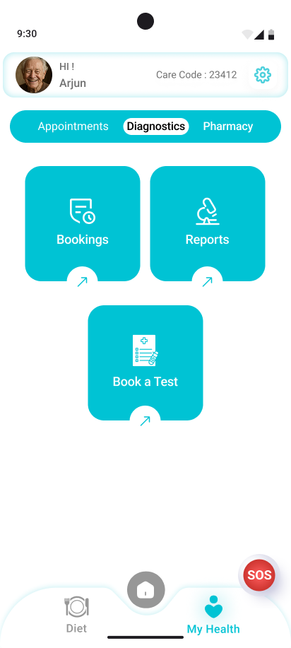
Our design philosophy empathizes with the real-world challenges of the elderly—tremors, reduced dexterity, and visual decline. Touch targets must be large, clear, and comfortably spaced. Text should be comfortably legible, with large fonts that reduce strain and support aging vision. This isn't just about usability—it's about meeting our users where they are and ensuring they feel accommodated, not challenged.


Guiding Attention with Visual Hierarchy
Every screen must emphasize the most important action or piece of information. Visual hierarchy isn't decoration—it's direction. It should gently guide users toward what matters most.
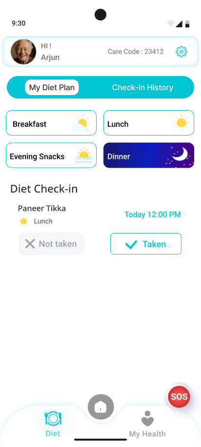
Simplicity with Intent
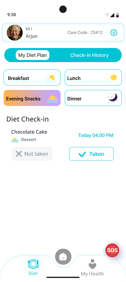
We do not believe in showing less for the sake of minimalism. We believe in showing only what is needed, and when it is needed.
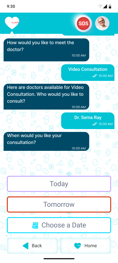
Conversational Interface
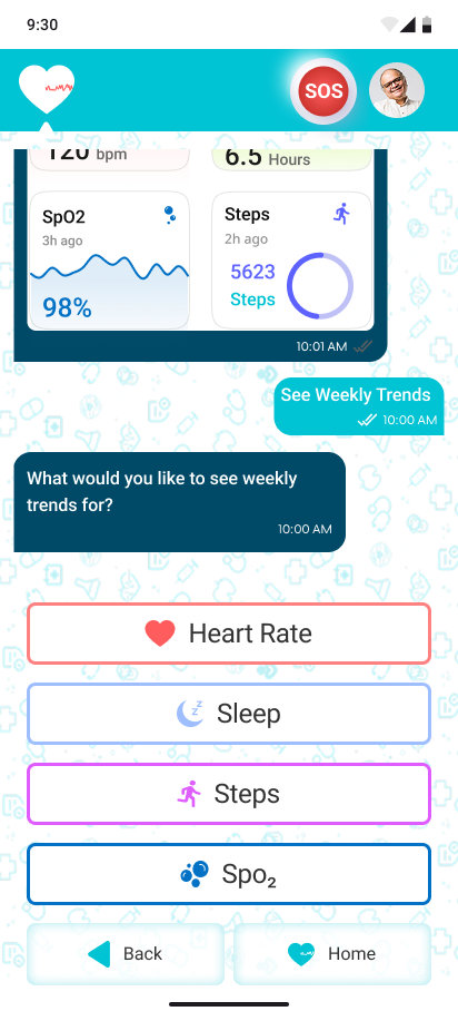
Traditional settings menus are replaced with a conversational chatbot flow—not powered by AI, but by thoughtful design. Users will make changes as if speaking to a helper, never facing more than three choices at a time.


Building Confidence, Not Anxiety
Elderly users often fear that a wrong tap might cause irreversible harm. Our design must eliminate that anxiety by making every action feel safe and recoverable. Interfaces should reassure users that they are always in control, with clear confirmations, undo options, and fail-safes where needed.